I’ve been experimenting with my data presentation recently, trying to make it a bit more ‘fun’ (read – epic procrastination which has a thin questionable veneer of usefulness). In the post below I’ll talk about how I had a go at getting some data away from the awful, awful, plotting abilities of Matlab, and getting it into Blender.
If you haven’t heard of it before, Blender is a FOSS 3D animation package which doesn’t really have anything at all to do with data analysis. However it does make pretty pictures rather well, and isn’t that the real goal of science?
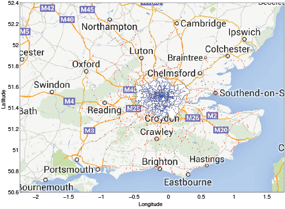
To be more specific, one of the example datasets I’ve been looking at the distribution of light rail stations in and around London. The raw data is a ~10MB .csv file, and when imported into Matlab looks like the following, all 1274 stations within 100km of London (for those of you anywhere outside of London, that is approximately 3 stations per square metre).

etc…
We get the name of the station, which kind it is (MET = tube station, RLY = railway station), and its geographic location. For my purposes, the first thing I needed to know was which London borough the stations belong to. London is subdivided into over 30 boroughs, and given enough digging around on the web it is possible to find the latitudes and longitudes of their borders. There is a handy little script on the Mathworks File Exchange called plot_google_map which simply overlays the relevant Google Map bitmap onto your plot. Overlaying the borough boundaries gives us a plot which looks like the following.

Here I’ve passed the coordinates of the borough boundaries to the fill command, which creates a filled polygon on the current figure axes. This is all very nice, and in fact we can see the Thames river as part of the borough boundaries immediately adjacent to the river as it snakes its way through the centre of the city.
We can now overlay the stations on top of this to visualise the local commuter network around London. Here I’ve coloured all stations within any of the London boroughs differently, but otherwise all stations are shown.
 This is continuing to be all very nice, but certainly in the centre of the city the dots turn into an amorphous mass. This isn’t very useful, nor that easy to look at, so lets attempt some data visualisation. The very simplest thing to do is something that anyone who’s ever come within a few miles of a computer will immediately attempt:
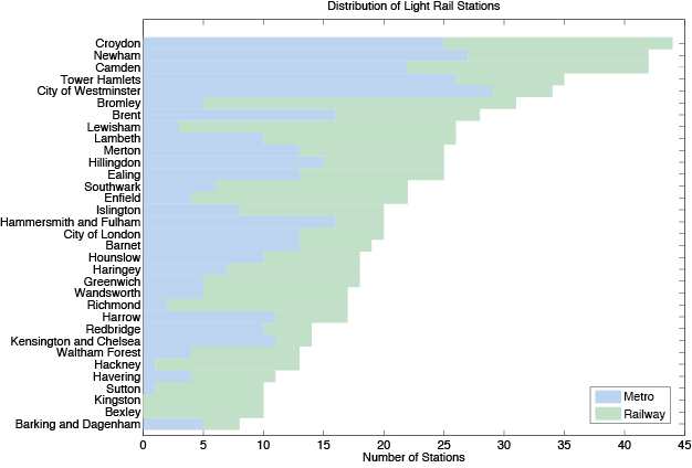
While they are very useful, and convey information effectively, bar charts are so incredibly, exasperatingly boring that just producing this one almost sent me into a coma. If it wasn’t for the sheer, nerve-jangling excitement of writing a blog post on data visualisation I may have never recovered.
So. Yawn. Croydon wins (at something!), Barking loses, my borough comes smack in the middle. What next? Well, since I went to all the trouble of finding the exact coordinates of the boroughs and drawing them all out, how about we re-use that machinery? It is possible to change the ‘fill’ command mentioned above to colour each borough differently. Colouring by the number of stations then we can produce a map like this:
 This is better as it gives us an idea of the geographic location of the stations. Using a colour scale though, while fitting in with the rest of the blog, doesn’t immediately convey differences in number as well as the (shudder) bar chart. Can we mix the two then?
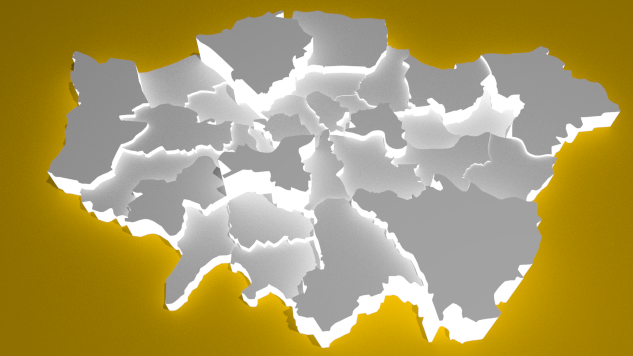
Again dipping into the relaxing, effort-saving waters of the file exchange, I found another script which will extrude a patch into 3D here. The principle is simple – in order for Matlab to draw a 3D object, it needs to know the coordinates of the vertices of the object and how those vertices join up to create triangles. For each coordinate in a boundary of a borough then, we make a copy directly above. By joining up the coordinate copies and mentioning this to Matlab, we can draw a series of triangles which look like a tube in the shape of a borough (in this case, Brent):
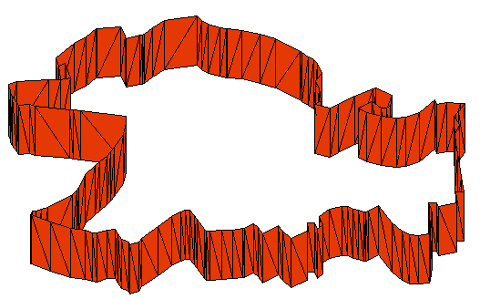
It should be obvious here how the triangles of the ‘walls’ of the tube are formed. Finally, we just need to fill in the polygon on the top and bottom of each tube and we get our nice colour-coded spatially-aware histogram.
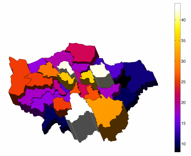
This is actually pretty good as far as the rendering in Matlab goes, and although it isn’t perfect at quantitatively displaying data, it sure is a hell of a lot less boring to look at than a bloody bar chart – and much more fun to make too.
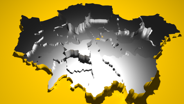
What if we want to go one better in rendering our data though? We’ve done the boring stuff, lets have some fun and make the most ridiculous graph possible. We just need to get the above 3D structure exported in a format compatible with Blender. Dipping my toes back into the now-familiar waters of the file exchange, I spy the eminently useful utility stlwrite. This will take a Matlab collection of faces and vertices and write them into an .stl file, which Blender will happily digest.
Unfortunately we’d like everything in the form of triangles, and those borough boundaries are anything but. Fortunately there exists a technique called Delaunay Triangulation which will ‘mesh up’ those polygons into a collection of triangles. The sequence of images below shows how we progress from the raw patch, to the triangulation, and then with the spurious ‘external edges’ removed.

Finally then we can export everything into Blender and start having fun! The simplest thing we can do is render the plot as above with the city made of a generic diffuse material, which looks a lot like white plastic. We can place the model on an orange plane for a splash of colour, and see what that looks like.

This is a much better render, given that we’re now going for nothing other than eye candy. In terms of potential time spent playing around with funky settings to see what happens, Blender must surely rank up there with dishwashers and new TVs. For example, we can make the ‘walls’ of our histogram start emitting light…
…or change the material to some sort of shiny metal.
A flash of inspiration got me thinking that the ‘towers’ of the histogram looked like the skyscrapers in the centre of London, so applying a few textures/bumpmaps/tutorials here and there we can end up at something like the following…

…and in animated form…
…which is all patently ridiculous and uninformative, but it sure does waste a lot of time.

STL may require triangles, but OBJ format does not. You should have been able to feed your polygons directly into recent versions of Blender using OBJ. STL is more intended for 3D printing, which was not what you were doing here.
LikeLike
Thanks for the tip!
LikeLike
This is pretty enjoyable, but didn’t you say Croydon has more stations than Bromley? Bromley is higher in the Blender version, and that can’t be explained by a conversion to density instead of frequency either (as expected of a histogram), since Bromley is the larger of the two.
LikeLike
(for those of you anywhere outside of London, that is approximately 3 stations per _square metre_).
per square metre? …. I am having fun visualising that …
Are they arranged vertically? Do they overhang the edge of the square metre?
Really love your site, by the way!
I just forwarded the link to my colleagues (we are chemical engineers .. but working in modelling, so appreciate this stuff).
LikeLike
I’d kill to get a third of a square metre of space on a tube train! Thanks for the comment, I’m always on the lookout for approachable and fun problems to write about, if you come across something accessible to non experts in your field get in touch. As I run out of ideas I gradually become more physics heavy…
LikeLike