A while back I heard about the Summer Data Challenge, hosted by my university. A number of datasets are available to download and analyse, and I chose to look at data on the selling price of properties in London over the past 5 years. I’ve assembled a number of plots here in order to examine this slightly cumbersome dataset more easily.
London’s property market has been on a bit of a tear recently, though there are signs things are slowing down (finally!). As a young person in London, the very thought of buying a property seems faintly ludicrous. Is this the case though?
The dataset from the challenge contained the selling prices, selling year, type and location of the 1.3 million properties sold within 100 km of the centre of London since 2009. This is a lot of data (though I wouldn’t say its ‘big’), but manageable enough.
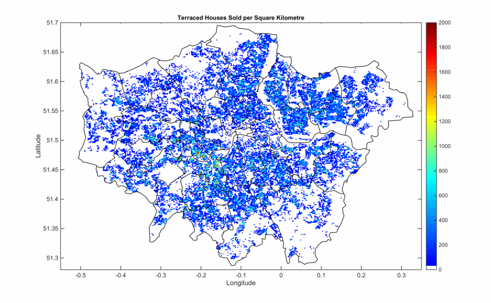
My first step was to limit the analysis to houses within one of London’s boroughs – fortunately I already have the co-ordinates of the borough boundaries from a previous post. After discarding 800,000 properties, I’m left with 500,000 which were sold over the last 5 years. By binning the properties into small areas approximately 10 arcseconds to a side, I get the following (with borough boundaries overlaid):
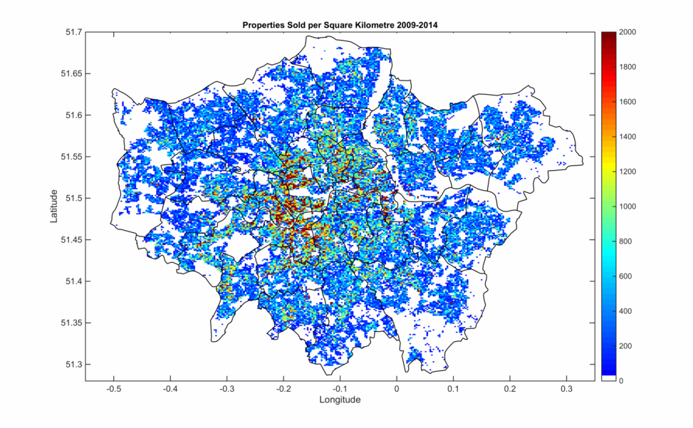
Unsurprisingly the highest numbers of properties are sold in inner London where the population density is highest. Also visible are a number of ‘town centres’ farther from the centre with local bumps in property density. I can decompose this distribution into the different types of property too, with the same colour scale below marking 0 – 100% of properties.
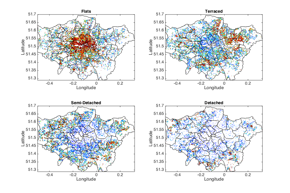
As expected, flats make up the majority of properties in the centre of the city, where large buildings can be converted up more profitably. There are a sizable number of terraced houses too, but most of these are a little farther out. The next categories of property, semi-detached and detached houses, really don’t kick in until the outer edges of the city. I suspect most closer in to the centre were long ago carved up into lucrative flats.
Speaking of lucrative, we can colour-code instead by the average prices of the properties inside each 1o arcsecond square. London property prices have forced me to resort to a logarithmic scale, due to some areas reaching average prices of £10 million or more. Below I’ve capped the scale at £3 million, and yet you see parts of Knightsbridge and Belgravia bumping against and over this limit.
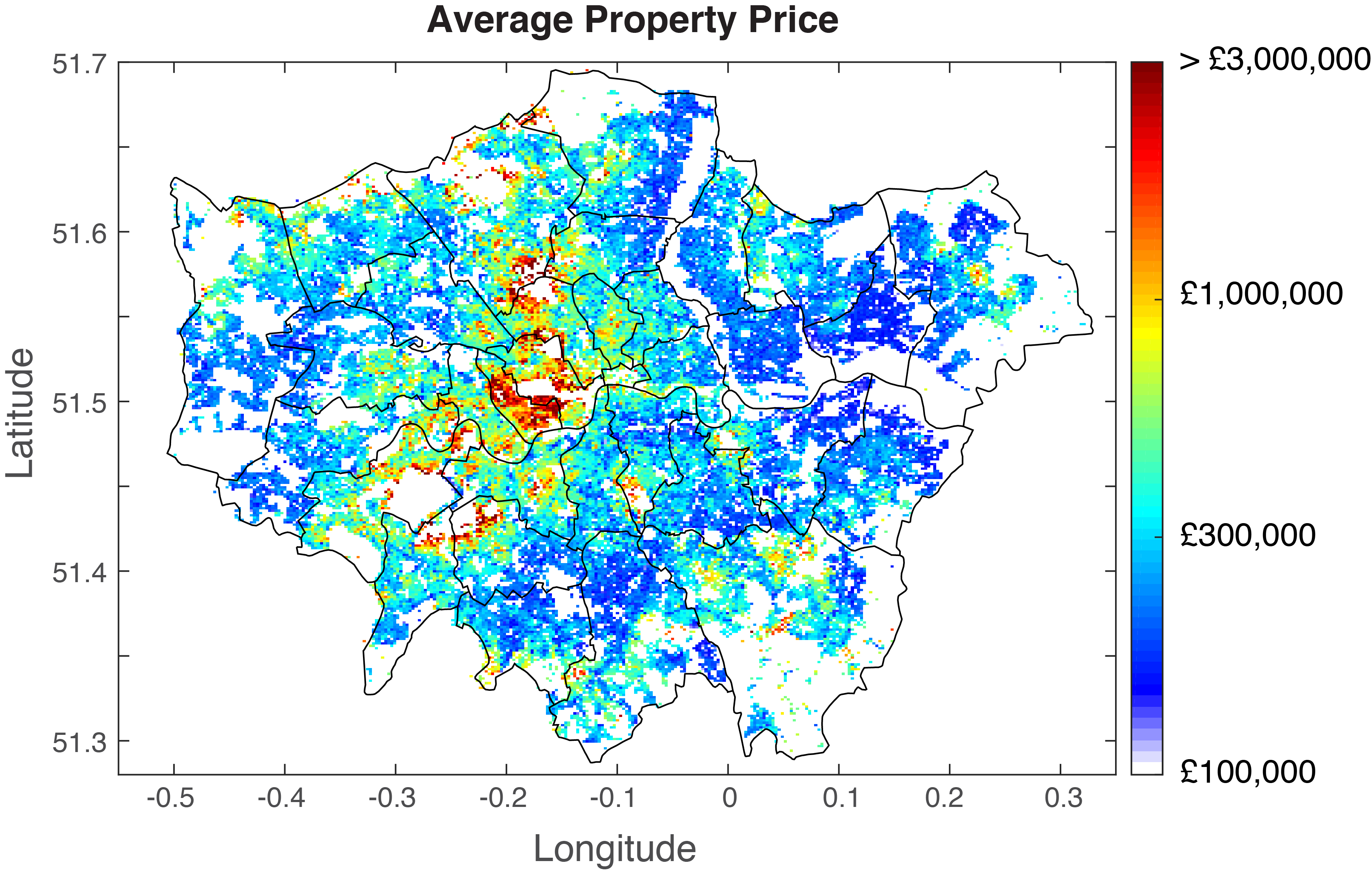
Prices are obviously high in the centre, but also significantly high in a wedge to the south west towards Richmond Park and beyond. Local hot spots are observed near parks (white spaces here), and near to some rail stations like Upminster in the east. We can again differentiate on property type as plotted below, where I haven’t used a logarithmic scale but the colour map is the same across plots.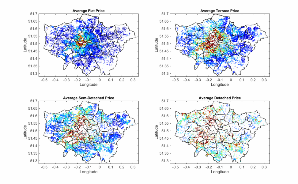
You’re going to suffer a jump in price as you move up property categories, and the premium for living centrally increases accordingly. Let’s get a little more quantitative – ignoring location now, I just plot the price distribution function.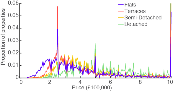
There is a general trend of prices peaking in the low £100,000s, and decaying away. Unfortunately some of the details of house pricing comes into play here, with big peaks at £250,000 and £500,000 just below the thresholds for stamp duty increases. There are other peaks at multiples of £50,000 complicating the plot and making patterns difficult to see, probably due to estate agents rounding up. Instead, let’s plot the cumulative distribution functions for 2009 and 2014, which smooth out these noisy peaks.
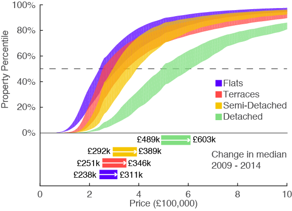
Now this plot is a little complicated, I’ll explain. For each property type there are two curves – one for 2009 and one for 2014. The region inbetween is filled, and marks the change in price distribution function from 2009 to 2014. If you want to find the change in median price, start at 50% on the y-axis, and move from left to right across the coloured region. This is indicated with the arrows below, where I’ve written the median prices in 2009 and 2014. It’s immediately clear that detached properties have somewhat appropriately detached themselves from the rest of the market, selling for more than double the prices of other properties.
We can go a step further and calculate the percentage increase in price as a function of property type and percentile – effectively the ‘width’ of each filled region above.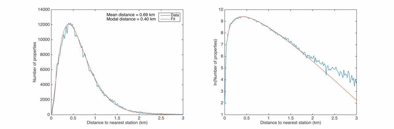
We see that the high-priced detached properties have grown in price pretty evenly across their range – cheap properties have gone up as much as more expensive ones. For the other types of properties the story is different – the most expensive properties have increased proportionally even faster than the cheap ones, with the high end of the market up more than 50% over 5 years. The market for ultra-expensive property is a growing one in London, and is growing even faster than everything else.
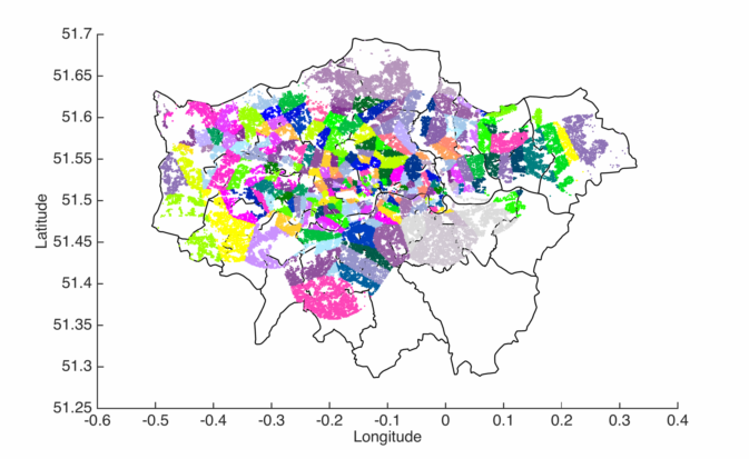
This is a bit depressing to hear, so lets look at a positive aspect of the city – public transport. Below I’ve plotted the half-million properties colour-coded by their nearest tube station, if there is one within 5 km. Notably we exclude the south-east of the city as the underground network is yet to reach there.
Clearly there are a huge number of stations in the centre, but how far are you on average from a tube station? For every property I find the distance to the nearest station, and bin into a histogram.On average you probably don’t live more than half a kilometre from a tube station, which is pretty great and a definite positive of the city. I noticed that this histogram fits pretty well to the probability distribution

for 


Finally, I now combine the two datasets and plot house prices as a function of tube stop. This is a useful thing to do, as many people when looking for a flat (me, for example) first prioritise which tube line they would like to be nearest to. In my case, both my partner and myself worked near Picadilly line stations so it was natural to explore our options along this line. We started near the centre and somewhat laboriously worked our way out until we found somewhere with a balance of price and convenience. It would be nice to see this visually, and would make it very easy to spot ‘cheap’ areas to examine more closely.
For each tube station I take all the properties which have that station as their closest station – i.e. I average over the properties of the people which might use that station as their local. I also exclude properties more than 5 km from any station. The tube lines and colours were gathered from the Wikimedia page here. I plot the tube lines geographically correctly, and stretch them vertically by an amount proportional to the local house prices.
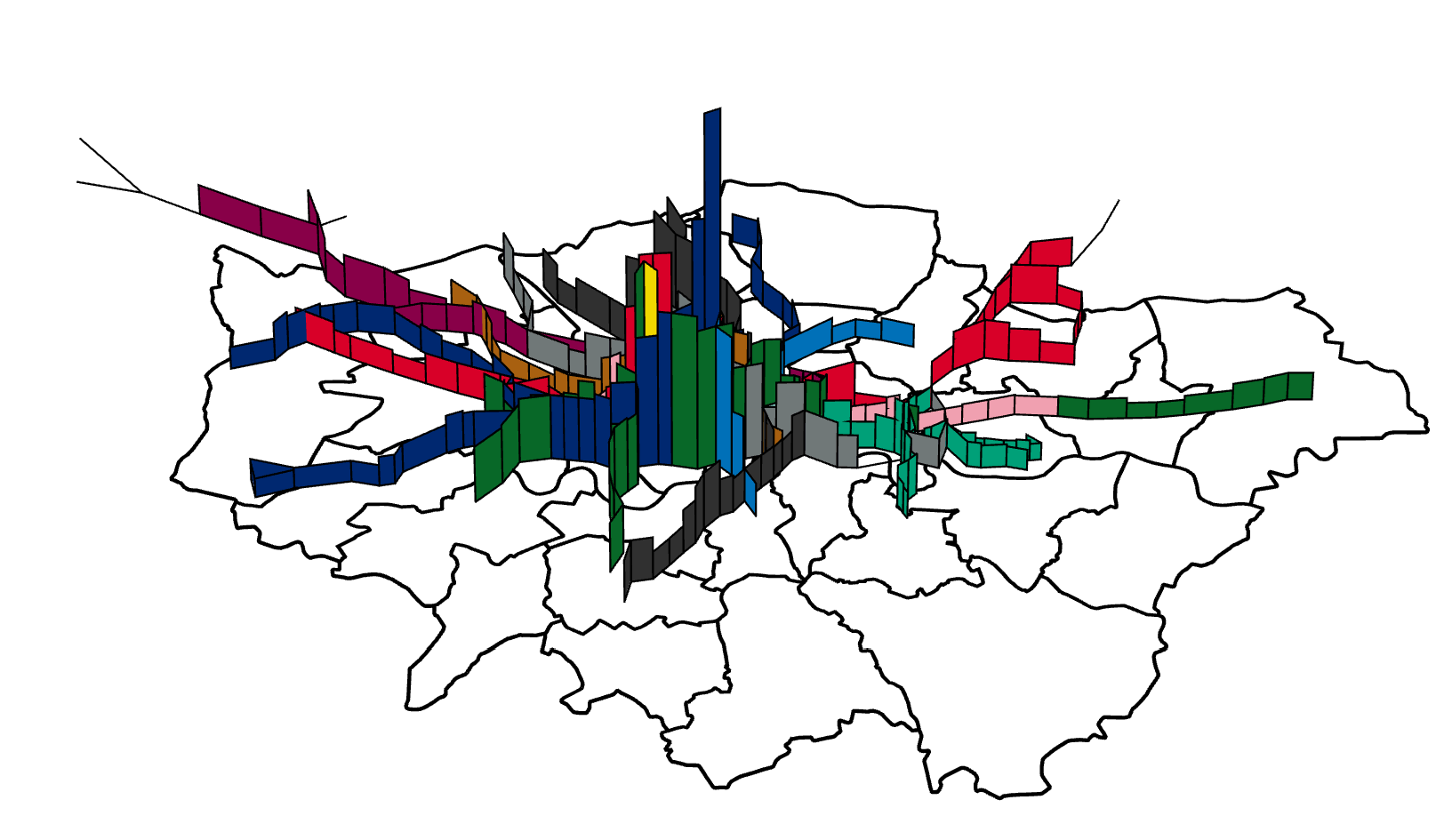
For completion, here are the tube lines individually.
Bakerloo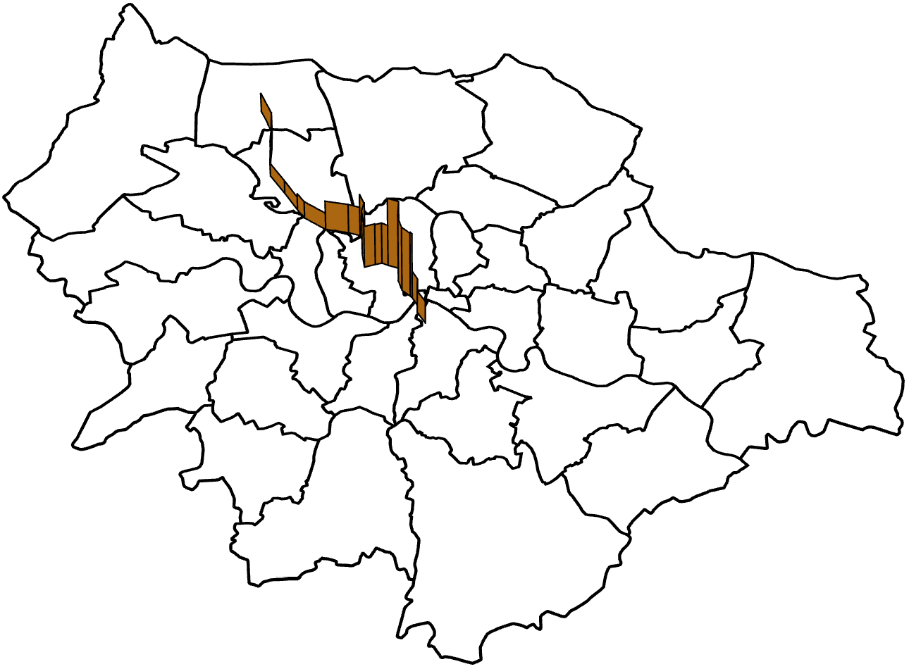
Central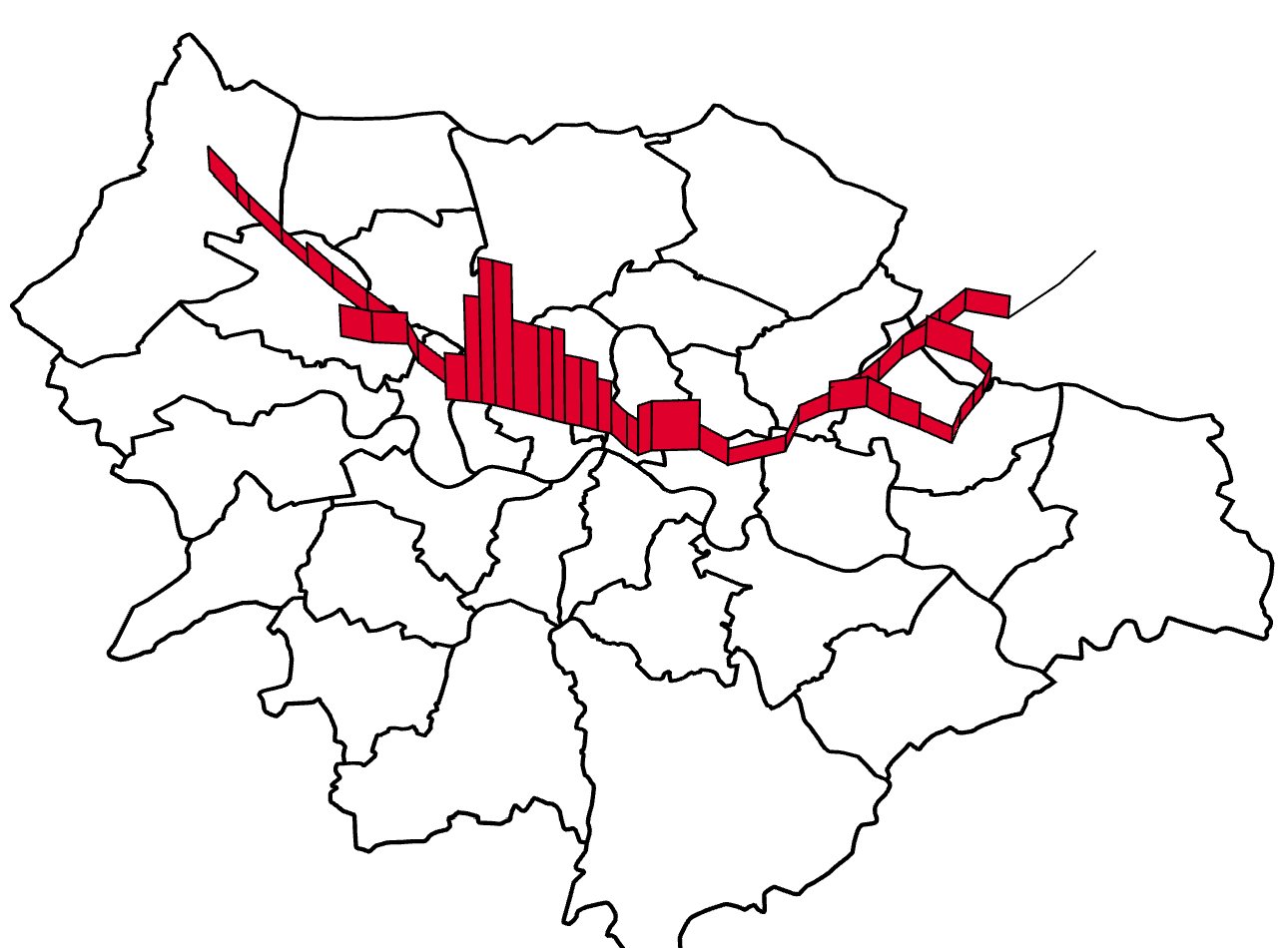
Circle (back when it was a circle!)
District
Hammersmith and City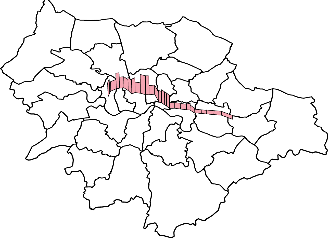
Jubilee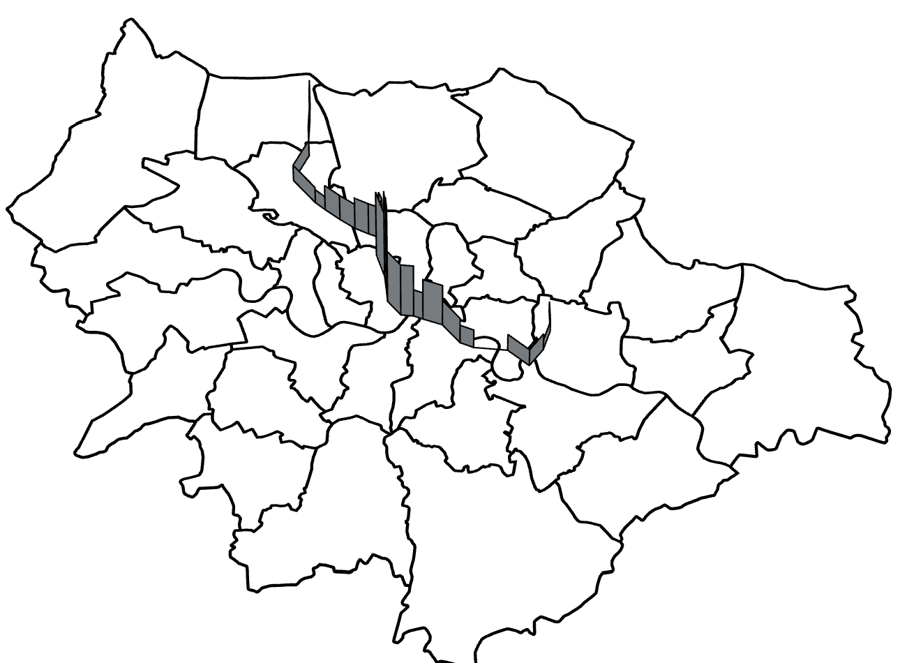
Metropolitan
Northern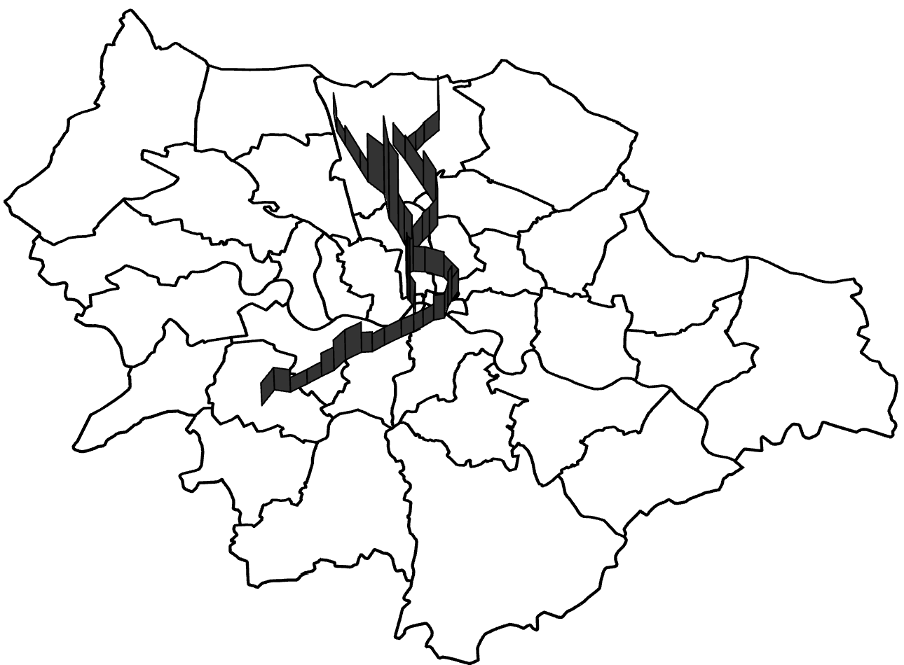
Picadilly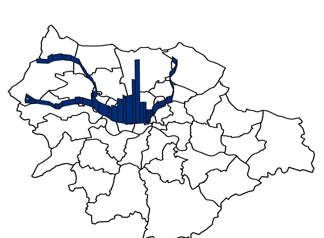
Victoria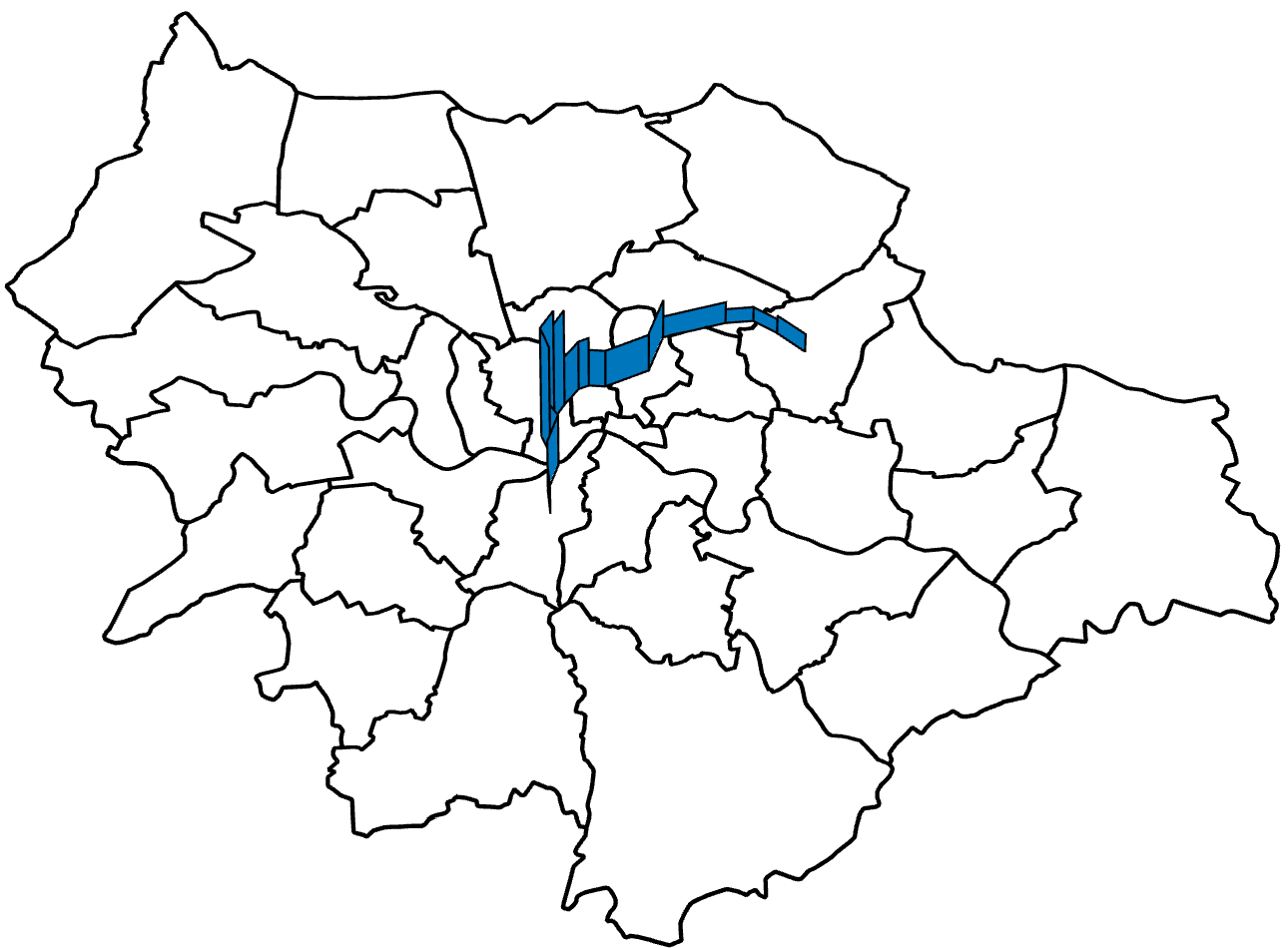
DLR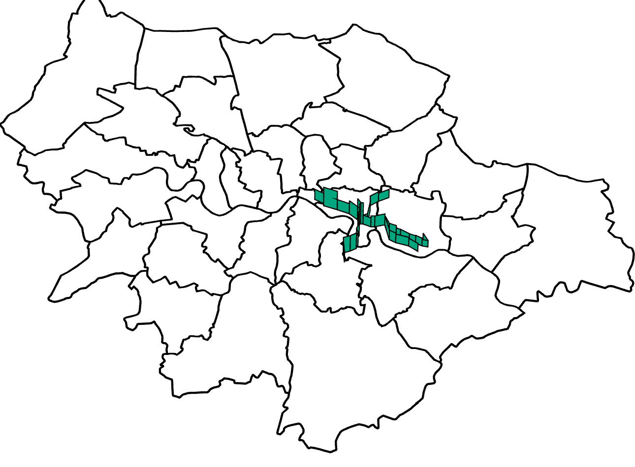

“Unfortunately the psychology of house pricing comes into play here, with big peaks at £250,000, £500,000 and multiples of £50,000 complicating the plot and making patterns difficult to see.”
While I agree with your comments regarding the £50,000 multiples I’m afraid you’ve missed something relating to the quarter and half million thresholds; these are where the jumps in stamp duty come in so it’s common practice for a house worth a little more than £250,000 to be priced a little below that number, ditto for the half million houses to avoid the increase in purchase cost.
If a property costs £250,000 then the stamp duty is 1%, if it’s £250,001 then 3% is due (3% to 4% for the £500,000 case). As a result of this the price is artificially deflated and often people will add a condition to the purchase of a property at £250,000 where the buyer will “purchase the carpets” or something similar separately for an additional £10,000 to make up the deficit while avoiding the extra tax burden.
Otherwise, great article.
LikeLike
Thanks for the comment! I’ll update the article, this was also pointed out to me on reddit.
LikeLike
There’s still time to enter if you want! We extended the deadline until Nov 23rd!
LikeLike
So there is! Can I be lazy and submit a blog post?
LikeLike
Well, you could do, although ideally we’d like a business or product idea based on it to be in with a chance of winning….
LikeLike
Dear Jasmcole
I would like to ask permission to use some of the figures in your post in our manuscript. Could you please grant us the green light to do that? We are developing a housing price model and your results on the London house market seems to be suitable for the evaluation of the predictive power of our model. Thank you very much and wish you have a nice day.
Best Regards,
Peter
LikeLike
Hi Peter,
Sure, you’re free to use any of the figures with attribution. If you’re writing a paper, would you mind sending me the link when it’s available?
I would warn you that the data in these plots is from 2014, but I’m sure you’ve read that.
Cheers,
Jason
LikeLike