The last time I looked at house prices it went pretty well, and I ended up winning a data science competition. There I was only dealing with a million or so records, and a relatively small 120 MB dataset. Then I found out it was possible to download 3.7GB of property sale records for all of England and Wales since 1995, so let’s have another go.
Thanks to the UK government open data initiative, it is possible to download a complete ‘price paid’ dataset here, which contains
residential property sales in England and Wales submitted to Land Registry for registration.
This massive file comes in .csv format, which isn’t very space efficient. For each of the 21,021,084 records I extracted the price, month, year and postcode. This was a good start, for example it is very quick to plot a histogram of the sale year:
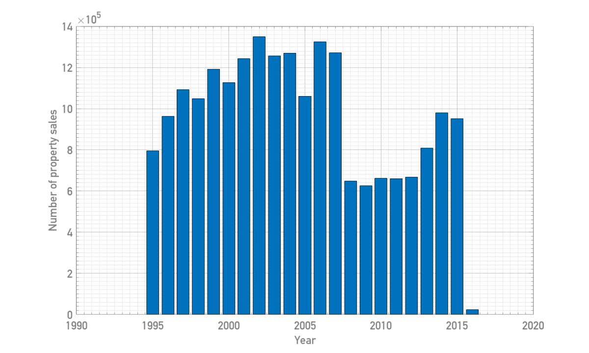
You can see very clearly the impact of the 2007 recession, with property sales dropping by 50% between 2007 and 2008. Only recently are sales starting to pick back up again (2016 is obviously not yet complete).
It is also quickly possible to visualise the property price distribution as a function of time. In the following I’ve calculated price quartiles, and adjusted the values for inflation such that prices are in 2016 pounds.
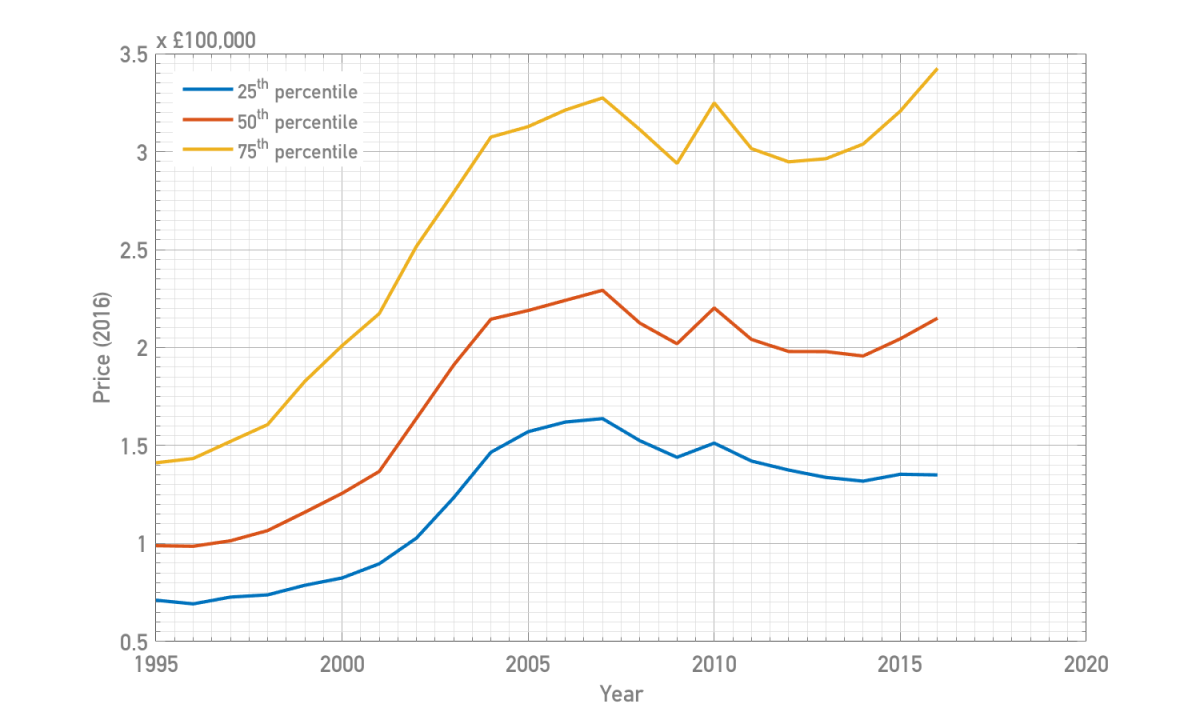
Again the effect of the recession appears to have been to put the brakes on house price growth around 2008, even at the higher end of the market.
To quantify the shape of the house price distribution function, I’ve chosen to look at an analogue of the Gini coefficient. This number is usually defined in terms of the distribution of income of a country as a measure of inequality. To calculate the Gini coefficient one must first calculate the Lorenz curve, which plots the proportion of the total income of the population as a function of the income that is cumulatively earned by the bottom x% of the population. If a country were perfectly equal, the bottom x% of an income distribution would also earn x% of the total income, and so the Lorenz curve is a straight line.
For my Gini analogue, I’ve defined the Lorenz curve so that the total property price below the percentile y is plotted as a function of the price of the percentile x. Referring to the figure below, the Gini coefficient is defined as the area ratio A/(A + B). Perfect ‘equality’ implies a Gini coefficient of 0, perfect ‘inequality’ implies a Gini coefficient of 1.

In this case a large Gini coefficient would imply a wide disparity in house prices, and a small one a similar range of prices. Plotted as a function of time for the entire country we have the following:
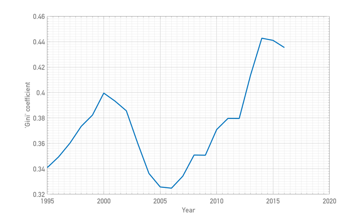
The curve here is a bit different to what might be expected – there is no significant transition at the time of the recession. House prices diverged in price until 2000, then moved progressively closer in price until 2006 before starting to diverge again, reaching a peak in 2014. One argument to make here is that since the recession houses have preferentially been purchased by those able to afford them, both at the low and the high end. If the middle of the market was depleted the Gini coefficient would increase, marking the larger spread in prices.
To examine this effect further, it is necessary to start mapping the location of the houses. The problem here was that I only had the postcodes rather than the latitudes and longitudes. What I needed then was to look up the postcode locations for all 20 million records. There are free services which can help, but not for so many records, and certainly not for free!
If you do a bit of digging you can find a postcode list for the UK at the website of the Office of National Statistics, which I promptly downloaded. This contains the latitude and longitude of every postcode. Now the number of postcodes in the UK is the much smaller database of the two, with only 2,579,173 records, but for each entry in my house price list I needed to look up a match for the postcode. I need to do 20 million postcode lookups, but I don’t care about the order they’re stored in. Data structures 101 states that I should store the latitudes and longitudes in a hash table, with the postcode the key, if I’m ever to do so in a reasonable time.
It turns out that Matlab does indeed have a hash table structure as part of the containers class, and so to insert the famous postcode of Broadcasting House I can type
pclookup = containers.Map;
pclookup('W1A1AA') = [51.5186, -0.1438];
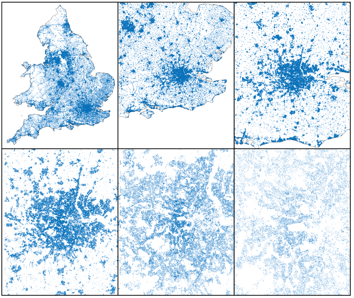
A little while later (Matlab is unfortunately not that quick…) I have coordinates assigned for all of my houses. What do 20 million houses look like when plotted? Here’s a gradual zoom in of 1 million of them:
This gives a good idea of the location of the houses in the database, but what about prices? I split the area above up into 1 million grid cells and averaged the house prices in each cell to produce a map of average house prices:

I’ve overlaid two outlines – the boundary of England/Wales, and the Greater London area (defined here as the union of the set of London boroughs). I found some of this data from the excellent Natural Earth website, which contains high resolution shape files for all countries.
There are a few interesting observations to make here. Close to home you can see the stupid-high prices in the centre and south-west of London, and surrounding counties. North of Newport and Cardiff you can also clearly see the streams of depressed houses up through the valleys of South Wales. Empty gaps appear in the moors, the national parks, the south downs etc., in contrast to the emerging large conurbation stretching through central northern England.
Not being able to help myself, I also visualised this data in Blender and rendered a flythrough video, replete with cheesy music:
Thanks to NASA for the earth texture, and to the excellent tutorials of Andrew Price for pointing these out the existence of these.
Using the London boundary, I can analyse properties separately depending on whether they are inside or outside London. For example, here are the fraction of total properties inside London as a function of time:
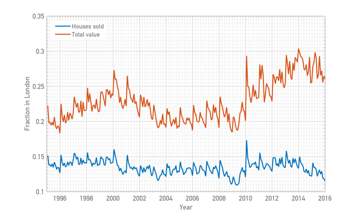
Contrary to what might be perceived, the fraction of sales inside London has remained approximately constant at 10-15% over the past 20 years. The fraction of total property value has fluctuated more, until around 2010 when it’s risen quite significantly. The population of London has increased by 1.5 million people in this time, indicating that lots more people are renting rather than buying.
I grew up in the south of a town called Bristol, and currently live in west London. How have the property prices changed in these two areas?
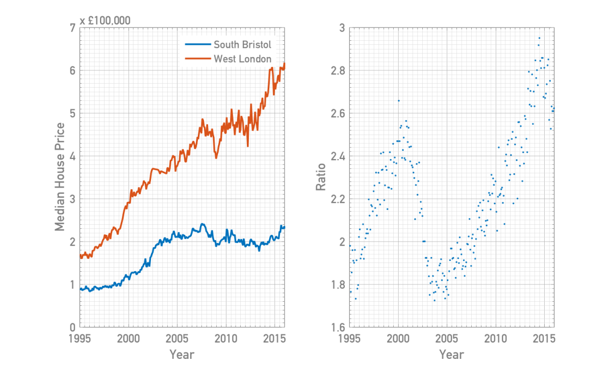
London got pricier until 2000, then Bristol prices accelerated until ~2005. Since then London carried on growing (with a brief dip near 2008) peaking in relative price near 2014. In the last few years Bristol has become a more desirable location, with house price growth exceeding London causing the ratio to drop again.
As we are comparing values inside and outside London, let’s plot the Gini coefficients as a function of time again:

Comparing to the previous plot, flattening price growth in London is linked to a dip in Gini coefficient. After bottoming out near 2004, the coefficient rose to a record high in 2014 at 0.48, though now seems to be falling again. Interestingly, the coefficient for properties outside London appears to follow the same trend, but a year or two later. If there’s a more sophisticated interpretation of this fact other than ‘London leading the market’ let me know in the comments.
I suspect there’s more to investigate here, especially in diversifying outside my usual London bias to other cities, so don’t be too surprised if another post appears in the future.

Cool article. However where you’ve put Exmoor in the fly-through is actually Dartmoor!
LikeLike
Thanks! And yes, this has been pointed out to me. As someone from the West Country who was on holiday near Dartmoor last summer, I should rightly be ashamed.
LikeLike
Interesting stuff. Your data backs up experience. In the 2005 to 2014 period strong growth came from international investment in super prime and prime london. If you’ve ever seen the migration pattern in London its overwhelmingly radial. People start off living centrally and move out to the periphery and eventually the suburbs. This makes perfect sense if you think about it cool to live in Hoxton when your 24 but get married and have a few kids and commuting suddenly seems sensible. Around 2012 2014 in some areas there was a huge disconnect between large houses and small flats with square footage in a 1 bed flat being half the price or less of the same space which was part of a large house. A few years later and a lot of jawboning about mansion taxes and some restructured stamp duty and a special tax on offshore company owned property and now the gap has fallen hard to where you see today.
LikeLike
Thanks for the insightful comment. I am really approaching this data blind as a non-expert, so hopefully any patterns in there speak for themselves. I have the coordinates of the London borough boundaries, so in the future it might be interesting to follow this analysis up with an inner-vs-outer London comparison.
LikeLike
Really great stuff! Are you able to share the code? I couldn’t see it on your Github.
LikeLike
Thanks! The code is nothing special, but I should upload it. At some point I’ll create a blog repository and stick everything in there (after a bit of cleaning up!).
LikeLike
Some untested info in case is of interest ( as someone who has been living in London for the past 20 years).
City Bonuses: not sure where you could get this data but it is generally perceived that Bonuses paid in the city of London skew the Housing market(would be interesting to test the theory).
LikeLike
This was so much fun to read, thank you! Inspired by your article, I have started to import and play with the same data.
You mention 20+ million records at a few places in this piece. I just wanted to clarify something that I’ve noticed as I’ve begun to import the Land Registry’s Price Paid Data. The 20+ million records in this dataset correspond to individual property sale transactions. And from my initial experimentation, the number of unique physical properties that this corresponds to is about 60% of the number of transactions.
Given this, would you agree that for replicating your 2D and 3D spatial plots of prices, it would make sense to pick the latest price per unique property? (As opposed to working with all 20+ million records.)
LikeLike
Hi Harish, thanks for the kind words, and I’m glad I’ve inspired you to have a play with the dataset yourself.
I actually didn’t count the number of unique transactions, I suspected that each property would be represented multiple times but decided that I wasn’t worried as I only cared about the distribution of market prices as a function of time. I initially wanted to make an animation of house prices over time, for which I needed all the data. At a high enough resolution that the map has interesting features, the histograms were under-populated and so I gave up on this idea and just lumped everything together (accounting for inflation).
Even accounting for inflation though, house prices have changed significantly since 1995 so a map integrated over time won’t be as relevant as the latest prices, so your idea sounds like a good one. Additionally, given that the locations I used were only accurate down to individual postcodes, one could also just keep a running mean/median for each postcode which would cut down the number of entries to ~2 million for the purposes of making a map.
One idea you have given me though is mapping turnover – plotting the time between distinct purchases of properties. I suspect that the turnover will be, as with everything else, highest by far in London. Please do get in touch if you find anything else interesting in the data!
Cheers, Jason
LikeLike