Forgive me for writing yet again about the weather, but
- It’s part of my national heritage, and
- This summer has had genuinely terrible weather.
Of course it remains to be seen exactly how terrible, and in great and unrelenting detail. How better to honour the time-worn traditions of my people?
The idea for this post was kicked off during one of my many frequent perusals of the excellent Met Office rainfall map:

This map has most of the hallmarks of a great data visualisation:
- Data takes centre stage
- Immediately obvious what it represents
- Very high information density without overwhelming
- Very smooth interaction (it’s amazing how often this is not prioritised, even in ‘professional’ data tools)
One thing that struck me was how often when scrubbing back and forth that rainfall ‘features’ stayed stuck in place, presumably because some part of the geography was causing more rain there. Wouldn’t it be nice to get hold of this data?
Getting hold of the data
Through some judicious reading of the network requests triggered while browsing this map, I found that the historical rainfall maps are available from URLs which look like:
https://maps.consumer-digital.api.metoffice.gov.uk/wms_ob/single/high-res/rainfall_radar/2023-06-01T06:15:00Z.pngAll that remained then was to get a whole load of them:
import requests
days = range(1, 30)
hours = range(24)
minutes = [0, 15, 30, 45]

prefix = 'https://maps.consumer-digital.api.metoffice.gov.uk/wms_ob/single/high-res/rainfall_radar'

def do_requests():
  for day in days:
    for hour in hours:
      for minute in minutes:
        url = f'{prefix}/2023-06-{day:02}T{hour:02}:{minute:02}:00Z.png'
        bytes = requests.get(url)._content
        with open(file.replace(':', '-'), 'wb') as f:
          f.write(bytes)
Warning: the Met Office aren’t exactly thrilled by this, and will aggressively rate-limit you. Fetching the data for this post took multiple days.
After some length of time, I am now the proud owner of 4,704 PNG images which look like a bit like this:
Smoosh them all together into an animation (after much swearing at ffmpeg and PIL), and you have something very pleasing indeed:
In the UK this year, the early part of summer was warm and very dry – you can observe in the above video that once July arrives, we’re constantly battered by incoming waves of rain. It’s just about letting up now as I write this post in August 2023.
Looking at the data
While I would normally be pleased to call it a day with the effort that went into making the video above, I remained curious to look at the distribution of rainfall across the UK. In particular:
- Where are the spots that rain is concentrated?
- Since I moved from London to Bristol, is it really as much rainier as I think it is?
Step 1 is to convert the god-awful jet colormap into real numbers, add the images together, and re-plot the rainfall summed over the above images on a more linear colormap:
This is so cool! You can see
- The fact that the rain comes predominantly from the lower-left of the image, given that it appears to be deposited on the West-facing sides of hills
- Various radar artefacts that I guess are pointing to the location of the rainfall radar stations in the UK? I don’t think this is privileged information
- The Scottish Highlands getting absolutely hammered
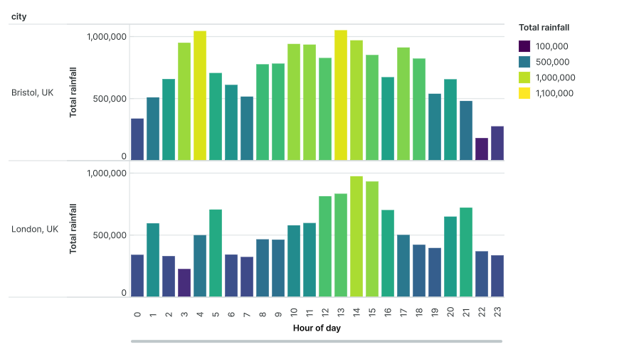
This rainfall data is actually stored as a 10GB 3D numpy array, so we can also slice it in different directions to visualise it in different ways. For example, here are longitude/time planes for 3 different locations. Note how Bristol/London have quite similar rainfall ‘barcodes’, whereas the Highlands is quite different (and much wetter!). Also note how the lower parts of the image (earlier in time) are much drier.
(I did try in vain to visualise this numpy array in 3D using tomography software, but didn’t manage it. If you’ve got any ideas – let me know!)
Finally, to expose this data a little better than I usually manage, I’ve created a Count canvas here with a heavily-downsampled version of the full 3D dataset formatted as a CSV file (it might take a little while to download depending on your internet connection):
Borrowing some of the plots from the canvas above, I can note a few things:
- It does rain more in Bristol! And typically earlier in the day. This matches with my anecdotal experience.
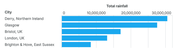
- The rainiest city over this period is Derry, the driest is Brighton. No surprises there, but the difference between the two is enormous!
Thanks for reading! If you find anything else interesting from the canvas above, let me know down below in the comments.
And now that I’ve given something back to my loyal and dwindling readership, I can feel even freer than before to go almost a whole year without posting anything again. See you then!

A quick Google brings up this page with masses of information about rainfall radar in the UK, including their location…:
https://www.netweather.tv/weather-forecasts/news/9866-understanding-weather-radar#:~:text=There%20are%2018%20weather%20radars,a%20five%20minute%20scan%20period.
… So I think you’re right that the locations are not privileged information.
LikeLike
Hi Jason, it’s funny – this blog inspired me to start my own, and I did a similar analysis a few years ago (granted with a different source, and only 24 hours) here: https://tafc.space/qna/precipitopography
I really like your rain barcodes – I tried a similar thing a few years ago with movies, playing them top-to-bottom rather than past-to-future, but they didn’t really look like much, unfortunately
LikeLike
Haha no way! Great minds think alike and all that. Your title is much better than mine 🙂
I’m glad I inspired you to start a blog – I’m going to have a read of your posts now.
LikeLike