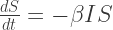
Diseases have been in the news recently, for one reason or another, and journalists are engaged in an increasingly ridiculous race to construct the most alarming headlines possible. How about we cut through the noise and indulge in a calming bit of maths?
There are many ways to model the spread of infectious diseases, the relevant equations can be made as intricate as required in order to capture the relevant details. Here we’ll have a brief look at the simplest possible model, the SIR model. See the rest of that Wikipedia page for a more complete listing of common epidemiological models.
The three letters correspond to the three types of agent included in the model:
for susceptible, agents which can be infected but haven’t been infected yet
for infected, agents which currently have the disease
for removed, agents which have had the disease and can’t get it again, either through death or immunity
Complementing these three definitions are two parameters:
– related to the rate of infection, agents moving from
– related to the rate of removal, agents moving from
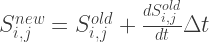
In this approximation we’ll consider a large number of agents such that we can consider the numbers represented by 

The rate of infection should be proportional to


where 

which isn’t a particularly nice equation to try and solve. Avoiding this approach for now, we can instead gain some insight from an approximate solution. At the beginning of the simulation, the number of susceptible agents is 


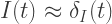
where 


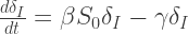
From the second of these equations, with the boundary condition that 


Now it’s important to consider the parameter ranges over which our initial assumptions are valid. We need 


As 

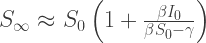
We can plot this as a function of

As reasoned above, for small
This is as far as I’ll bother to go with analytic solutions, let’s have a look at some real solutions calculated from numerically evaluating the differential equations. In order of increasing infection rate:
 The qualitative behaviour is similar for the three cases – as the infections rise, the susceptible population drops and the removed population grows. Once the infected population has decayed away, the values stabilise. Clearly the total proportion of affected agents is determined by the infectiousness of the disease.
We can again plot

The point 
This is an interesting exercise in getting to grips with the dynamics of disease spread, but is fairly limited in scope. All of the agents are assumed able to interact with one another, perhaps representing a population trapped in the same room. To extend this model, lets assume there are populations spread out on a grid 


with a similar term in the equation for 
As a warning this isn’t a good technique, but it is simple to implement which is a plus.
We can generate some random population map (using a Perlin noise algorithm), inject a single ‘patient zero’, and let the infection propagate. In the plots below I’ve plotted
 This is quite nice – the ‘currently infected’ population spreads out in a way reminiscent of a fungus, and moves more quickly through high population densities. The infection is eventually pretty lethal, and spreads across the entire population. High population densities are the site of quickest infection, and if we plot the contour corresponding to
 We can vary the infection rate
 Well we’ve done a bit of maths now, made a few gifs, let’s try something fun. From this useful blog post I can get a nice .png map of the population density of London. After removing the border, converting the colour values to mean population values, and normalising to a total population of 8.3 million, I have a 2D array of population number per pixel. I can inject a single infected person near Heathrow airport and see what happens to the infection. I choose the infection rate such that it begins to grow in numbers very slightly at the beginning of the simulation. I also lower the resolution of the population map so that my poor laptop can cope. To emphasise, this is an extremely simple model which doesn’t include any population movement, and should be interpreted appropriately.

After nosing around Hounslow a bit, the infection gradually spreads East. Upon reaching my borough of Hammersmith and Fulham it encounters a sudden jump in population density – this point is commonly defined as the border between ‘inner’ and ‘outer’ London. The infection can now run amok, and swiftly devours the dense centre of the city. The increase in infected population allows it to spread backwards through the rest of West London. The Thames river and Lee Valley act as a barrier in the East, protecting the North East of the city, along with Isle of Dogs. London doesn’t have the best record for pandemics, but at least you now know where to head in the event of a disease outbreak.
Let’s get a little more ambitious. What if we try the whole of England? Using the same technique as before (finding a population density map on Google image search), I generate a 2D array of population density. I again inject a single infected person near Heathrow airport. I also turn up the infection rate to get things to happen more quickly.

With a high infection rate, the virus is merciless and sweeps its way through the country rapidly. Some more remote places hold out for longer, but everywhere is vulnerable apart from the most sparsely-populated of areas. To avoid infection, head to the moors of Devon or the Lake/Peak District in the north. To hold out for as long as possible, get to Penzance, Carlisle of the Isle of Wight, i.e. the ends of the country. Newcastle is safe for a while, but eventually succumbs due to a high-density link to the south via Durham, Darlington etc. This isn’t meant to be an accurate simulation, but it does reproduce the common-sense conclusion: in case of a highly dangerous disease uncontrollably spreading through the country (highly unlikely), stay away from dense concentrations of people.
Finally, I will reiterate the fact that these aren’t realistic models, and I don’t claim to predict the imminent doom of the country due to, say, a single ebola patient landing at Heathrow. There is a more important consequence of this analysis, namely that no matter how deadly a disease, it is always possible to halt its spread by
- Lowering the infection rate (
- Lowering the susceptible population it is able to infect (
- Increasing the recovery rate (
Isolation wards address the first two points, and work on vaccines addresses the third. As we saw above, nudging these parameters even very slightly in the right direction can flip an outbreak from exponential growth to exponential decline. These precautions can then make a huge difference to the outcome of any disease outbreak, and should inspire a measure of confidence.
For a higher-quality video, see the Youtube version here:

Thanks for the inspiration! http://maxberggren.github.io/2014/11/27/model-of-a-zombie-outbreak/
LikeLike
Brilliant! Looks like you’ve inspired someone else too, we’ll have the whole of Europe simulated soon. How long did this simulation take to run? I think my population map had something like a million elements, and with Matlab it took ages.
LikeLike