What does this title mean? What’s with the recent bus obsession? Is this post even about buses, or are they just being carelessly shoehorned into every post title from here on out? Excellent questions, thanks for asking. Allow me to explain.
In my last post I had some fun exploring a sample of the bus data from the excellent Transport for London Open Data initiative. I found that bus arrival times appear to be Poisson-distributed, and posited that they may come in clumps more often than you might expect (or hope).
Getting the data
One of the comments I heard was that I was only sampling one particular time, and perhaps the bus distribution was a fluke of some kind. To appease those that worried, and to more efficiently procrastinate, I set up a Python script to download the bus waiting times every 15 minutes over the course of a week. It turns out this is easy to accomplish on OSX using the launchctl utility. In my case, to run a Python script I needed to place a .plist file in the ~/Library/LaunchAgents directory, the contents of which look something like:
<?xml version="1.0" encoding="UTF-8"?>
<!DOCTYPE plist PUBLIC "-//Apple//DTD PLIST 1.0//EN" "http://www.apple.com/DTDs/PropertyList-1.0.dtd">
<plist version="1.0">
 <dict>
  <key>Label</key>
  <string>com.yourjobname.plist</string>

  <key>ProgramArguments</key>
  <array>
     <string>/Library/Frameworks/Python.framework/Versions/2.7/bin/python</string>
     <string>path/to/python/script.py</string>
  </array>

  <key>EnvironmentVariables</key>
    <dict>
        <key>PYTHONPATH</key>
        <string>/Library/Frameworks/Python.framework/Versions/2.7/bin</string>
    </dict>

    <key>StandardErrorPath</key>
    <string>path/to/error/log.log</string>
    <key>StandardOutPath</key>
    <string>path/to/output/log.log</string>


  <key>StartInterval</key>
    <integer>15</integer>
 </dict>
</plist>
This sets up a job to run every 15 minutes, making sure to set the PYTHONPATH variable and assign some files for standard outputs. To start running this job one would cd to the directory above and run
launchctl load -w -F com.yourjobname.plist
or to stop
launchctl unload com.yourjobname.plist
One week later I was the proud owner of 5GB of tantalising bus-based data. To reiterate the last post, for each time point I sampled I looked at all of the bus stops in Greater London and tallied up for each the time a person would need to wait for the first arrival of every type of bus at that stop. I then have a distribution of 25,000 or so bus waiting times, every 15 minutes for a 7 day period.
The model
Stealing a plot from the last post, the distribution of bus waiting times is approximately exponential, with most buses arriving soon, but some buses taking a long time to arrive.

Mathematically, lets parameterise this distribution over waiting time, as a density of buses per unit time interval:

This generates a few useful identities. The median waiting time for a bus:

The total number of buses (in the 30 minute period allowed in the TfL data feeds):

The data
First lets see what this data actually looks like. We’re interested in how long we have to wait for a bus, so how does this vary during the working day? Plotted below are the median waiting times averaged across a working week, with 9am-5pm highlighted in grey.
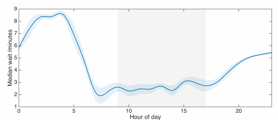
Wait times are a minimum in the morning rush hour, then stay low till around 7pm. They slowly increase in the evening, with a rapid jump after midnight. In London, this is when the schedules switch to the night time service. In the wee hours of the morning you should expect to wait around 10 minutes for a bus, but that’s as bad as it gets. Waiting times are very similar for all weekdays, especially in the evening.
Now, what does this look like over the course of a week? Plotted below are the same data over the entire interval I was recording, with the weekend highlighted grey.
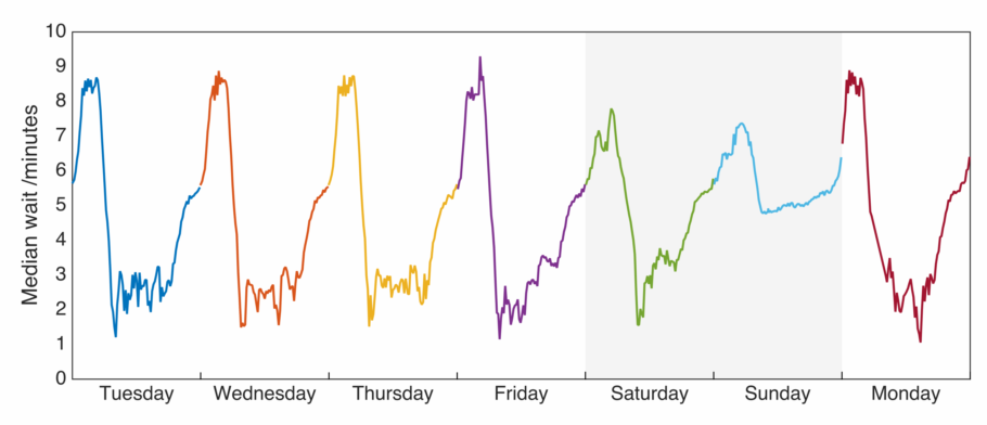
Saturday is surprisingly similar to the rest of the week, though with a less pronounced minimum over the middle of the day. On Sunday we see the average wait for a bus is significantly higher than any other time of the week.
Do these wait times arise from an exponential distribution, as was posited last time? Let’s plot the other parameters from the model. First 
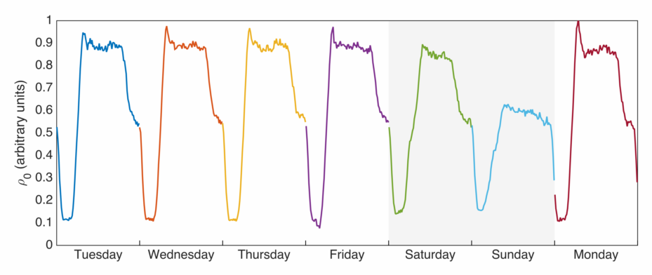
This mirrors what we might expect from looking at the waiting times above – when there are more buses arriving imminently, we would hope that the average wait time for a bus is lower. This doesn’t represent the total number of buses on the road though, we can plot that (or something proportional to it) as well:
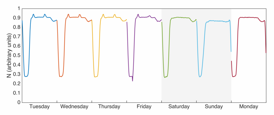
Now this is a bit surprising. The total number of buses is much more uniform, though we can see little spikes during the morning and evening rush hours which are noticeably absent on the weekend. There is also a little dip in the evening – perhaps the drivers are having their tea? However a number of features are missing – there isn’t a drastically different number of buses on the weekend, and there isn’t the ‘knee’ we observe in the evenings.
The data vs. the model
Given this surprise, how sure are we that the waiting times follow an exponential distribution?
Here we do what every scientist does when asked a question: plot everything against everything else, and see what pops up. From above we expect that 
I’ve plotted these two quantities below, coloured by how well that particular dataset fitted an exponential model (proportional to the 
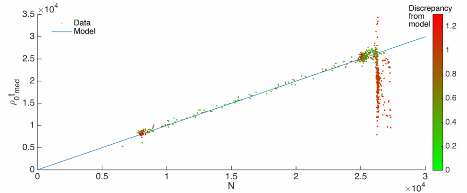
The blue line indicates proportionality, and the greener the point the better the exponential fit. We see the ‘green’ points tend to lie on the model line as expected. However, there is a large spread of ‘red’ points lying off the curve, suggesting the existence of datasets where an exponential model is a poor fit. This mostly occurs when 
Bus-steresis
We know now that we need to be careful in blindly stating that the buses are exponential, as an exponential distribution implies a ‘memoryless’ process, i.e. one which doesn’t depend on its history. This is fine for e.g. a radioactive nucleus, but less so for something as interlinked as a transport network.
As good scientists we’ll continue plotting things against one another until we are struck with inspiration. Here I plot the median wait time against the total number of buses, joined up in order chronologically:
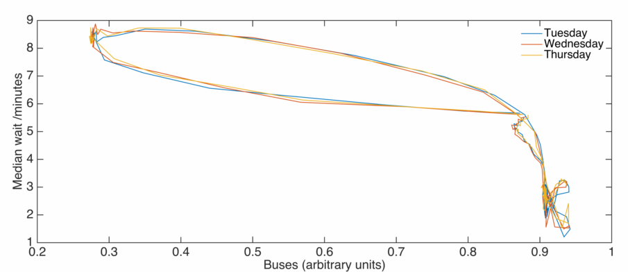 Now it is well known in science that discoveries are not heralded with a cry of ‘Eureka!’, but a mumbling of ‘That looks a bit funny…’. In this case the above plot does look a bit funny. Naively we might expect that as the number of buses is increased, wait times decrease. This is certainly true above on average, but there is a significant amount of structure too. Below I’ve smoothed out the lines, and annotated an averaged version of the above with the time of day:
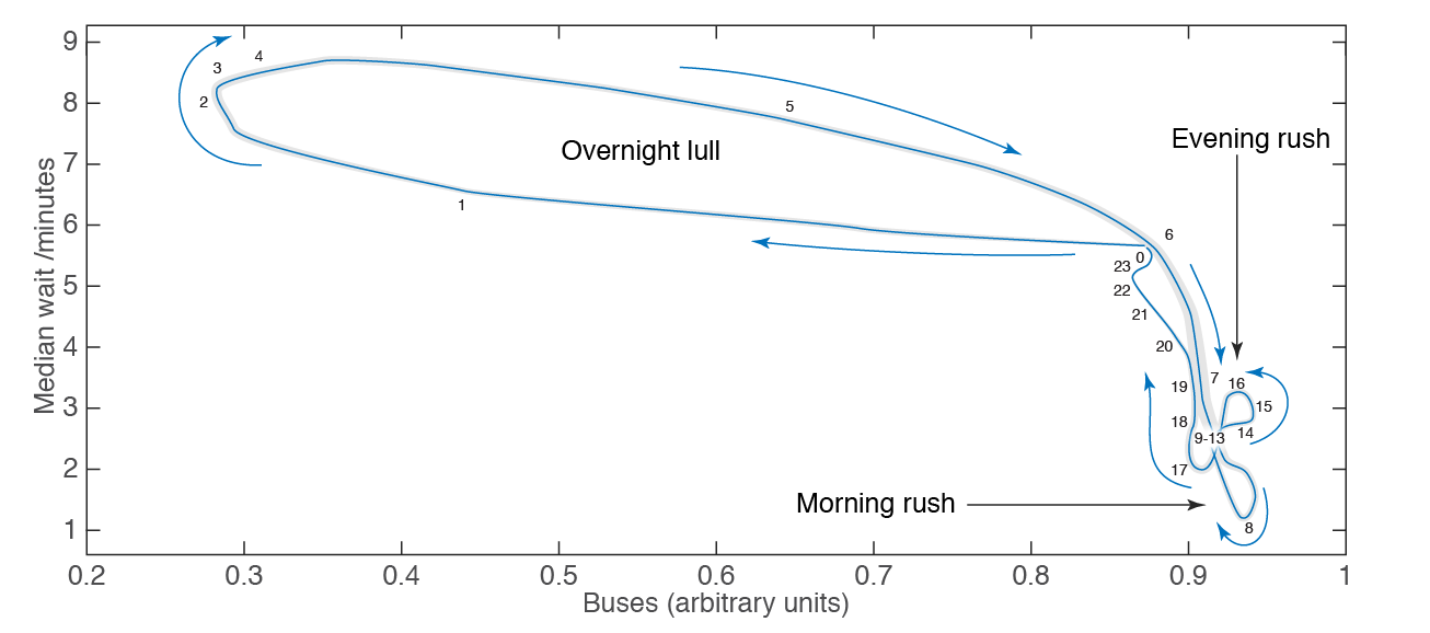
You can think of this as a ‘bus phase space’ which the system walks through each day, in a remarkably stable way from day to day. We start at midnight – zero on the plot. From here the number of buses rapidly decreases – moving to the left. However the average wait time doesn’t change hugely. In the small hours of the night we reach a minimum in the number of buses, with a sharp rise in the wait time. As the sun rises the number of buses rapidly increases, but the wait time is slow to respond, until approximately 6am when the wait rapidly decreases to a minimum near 8am.
During the day the pattern is difficult to see, but in general there are lots of buses with a low wait time. Around the evening rush hour the number spikes, as does the wait time initially. After 6pm or so the wait time rises sharply, even though the number of buses isn’t changing much.
You’ll notice there are a number of obvious loops in the plot, and this is a mark of hysteresis – the response of a system to an input depending upon the path we take to arrive at that input. In this case the system is the London bus network, the input is the number of buses being forced into this network, and the response is the average waiting time for a bus.
If this system were linear we’d expect no loops, but a nice straight line: more buses = lower waiting time, and that’s would be the end of that. Of course the real world isn’t linear, and importantly doesn’t react instantaneously to an input. In this case it takes time to add or remove buses, and its obvious that the wait time will depend on history through the traffic which has built up previously in the network.
This dependence on history indicates that the bus network does have memory, and therefore shouldn’t be described well by an exponential distribution. Curiously, an exponential distribution fits best over the course of the largest loop above, the most ‘hysteretic’ part of the phase space.
Finally its worth noting that there are no new ideas in science, merely rediscoveries, so of course this idea of traffic hysteresis has been discussed in the literature (see below). Many authors see these loops in ‘speed-density’ phase space (see e.g. my post here) from real world measurements, and it is possible to reproduce them in analytical models of traffic flow.
Further reading
A mathematical theory of traffic hysteresis (paywall)
Hysteresis phenomena of a Macroscopic Fundamental Diagram in freeway networks
Driver characteristics and their impact on traffic hysteresis and stop-and-go oscillations

2 thoughts on “Bus-teresis”