Once again, the world is facing the emergence of a nasty disease. I was last prompted to investigate the dynamics of infection in 2014 during the Ebola outbreak. Here I thought I’d examine a slightly different model to see what, if anything, can be learned.
In all the following, note that I am not an expert, and nothing written here should be considered the advice of a professional.
When I last looked at infection dynamics, I was interested in the SIR model, where a population of people is divided into Susceptible, Infected, and Recovered groups. In that model, infection occurs as the evolution of a set of differential equations, where people move through the S, I, and R populations.
While the SIR model was interesting to examine from a mathematical standpoint, the models currently in use to model the coronavirus outbreak are much more sophisticated. Those employed by the Imperial College group, informing much of the policy in the UK, are very granular in detail. For example, report 9 outlines the model:
Individuals reside in areas defined by high-resolution population density data. Contacts with other individuals in the population are made within the household, at school, in the workplace and in the wider community. Census data were used to define the age and household distribution size. Data on average class sizes and staff-student ratios were used to generate a synthetic population of schools distributed proportional to local population density. Data on the distribution of workplace size was used to generate workplaces with commuting distance data used to locate workplaces appropriately across the population. Individuals are assigned to each of these locations at the start of the simulation.
Report 9 – Impact of non-pharmaceutical interventions (NPIs) to reduce COVID-19 mortality and healthcare demand DOI: https://doi.org/10.25561/77482
These types of models are often known as agent-based models, where instead of approximating a group of people as a mathematical function, the people themselves are simulated performing (an approximation of) their daily lives.
I thought I’d whip up my own, very simple, agent-based model, and vary some of the simulation parameters to see what effect, if any, they had. I wanted the simulation to be large enough that statistical noise wasn’t an issue, and arbitrarily settled on a million agents, which for speed necessitated writing it in a compiled language – in this case, C++.
The core loop is, schematically, very simple, and goes like
std::vector<Person> people;

// Omitted - place a million people according to some population density

for (auto &person : people) {
  person.move(); // Move according to some rules
}

for (auto &person : people) {
  if (person.isInfected()) {
    auto nearby = lookup.within(person, r); // Find nearby people
    for (auto& other : nearby) {
      other.maybeInfect(); // If susceptible, perhaps infect that person
    }
    person.maybeRecover(); // If infected, perhaps recover
  }
}
Every person moves independently, then has a chance to infect anyone within a distance r. There’s nothing here as sophisticated as assigning work and home locations to each person, they just bumble around at random (which, it must be said, certainly approximates my quarantined locomotion pretty well).
Let’s see what this simulation looks like for England. On the left are the spatial distributions of the three populations, on the right is a timeline of the total numbers of each:
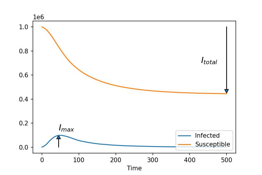
This simulation was initiated with a 0.1% infection rate, which is actually very high – equivalent to around 60,000 people in the real England. The initial infected agents are spread randomly throughout the density distribution. After 20 time steps, each agent has a 50% change of recovering each time step.
You can observe the infection spread in waves outwards from high-density population centres, before slowing down. The total infected fraction peaks at around 10%, and the total proportion infected in this simulation is around 50%.
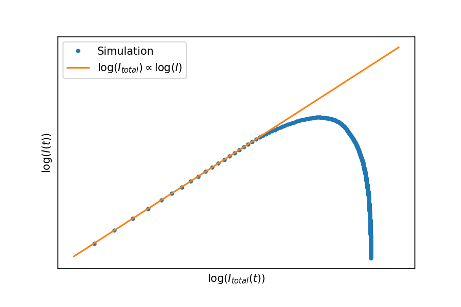
If we plot the total infected as a function of the infection rate, you see that initially the two are closely related, but eventually things start to tail off. In the UK we’re somewhere before this peak, but Italy and China are already observing the expected roll-off of infection rate.
As noted above, two of the important features to extract from a simulation are 

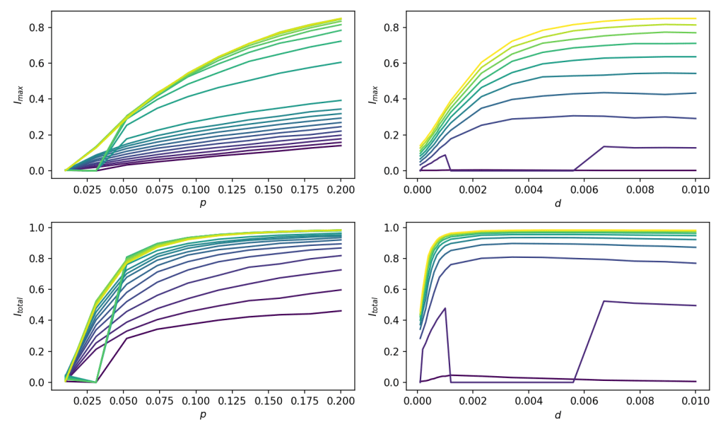
As these simulations were relatively quick to run, I ran a further 200 where I varied
– the probability of infection
– the distance each agent moved per time step
Plotted below are the peak and total fraction of infected agents as these parameters are varied:

Surprisingly, it was the distance moved which affected the infection rate most – you can see the dominant colour gradient is left-to-right rather than bottom-to-top.
To see this more clearly, here is the same data flipped around, so that ‘colour’ is now on the y-axis:
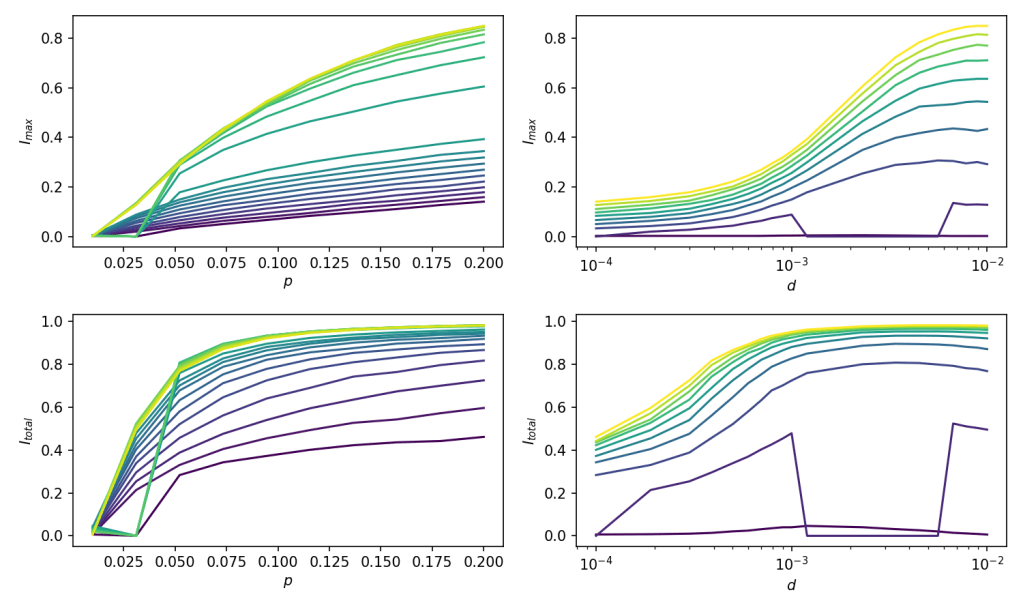 on a logarithmic scale
An interesting observation from the left-hand plots is that as 
As is often the case with any modelling I do for this blog, the main results are pretty obvious without doing any simulations: keep
