One of the many sad consequences of the current lockdown, possibly the most unfortunate of all, is that the famous Cooper’s Hill Cheese-Rolling competition will almost certainly not be taking place this year. In the spirit of finding light in the darkness, let’s at least have a look at how we may improve it for next year. With maths!
Once again, the world is facing the emergence of a nasty disease. I was last prompted to investigate the dynamics of infection in 2014 during the Ebola outbreak. Here I thought I’d examine a slightly different model to see what, if anything, can be learned.
It’s winter again in the UK which means even more rain than usual, often accompanied by oddly-named storms. Sadly this also occasionally means flooding for many parts of the country, a fact which I usually watched with some detachment from the other (safer) side of a news report. This year is different – I have bought a house quite near the river Avon, which makes the issue more immediate. I suppose I could campaign for flood defences, or petition my new local MP, but for now let’s stick to what I know: data and maths.
It’s been that time of year again, where I am forced to face my one and only weakness: wrapping presents. Rather than confront my failings, I’ve once again turned to my old friends: maths, computers, and bad puns.
This post is a classic example of the malady known as Jason-itis – idly wondering about a thing, and then having to dive deep down a rabbit hole to satisfy a geeky wish. In this case the thing was ‘I wonder how you make a 3D shape which looks like different shapes from different angles’, and the rabbit hole bottomed out at this GPU-accelerated demo. Let’s look at the stuff in-between.
I recently got a new phone, and have read online that its camera performance leaves much to be desired. As I bristle at the suggestion I could make a poor purchasing decision, let’s put this to the test. With maths!
Regular readers of this blog will note that 2019 has not been a particularly fecund time for new posts. This is principally due to my getting married recently – typically weddings are events with minimal overlap with the kind of topics I write about here. Unless, of course, one of the people getting married happens to be me.
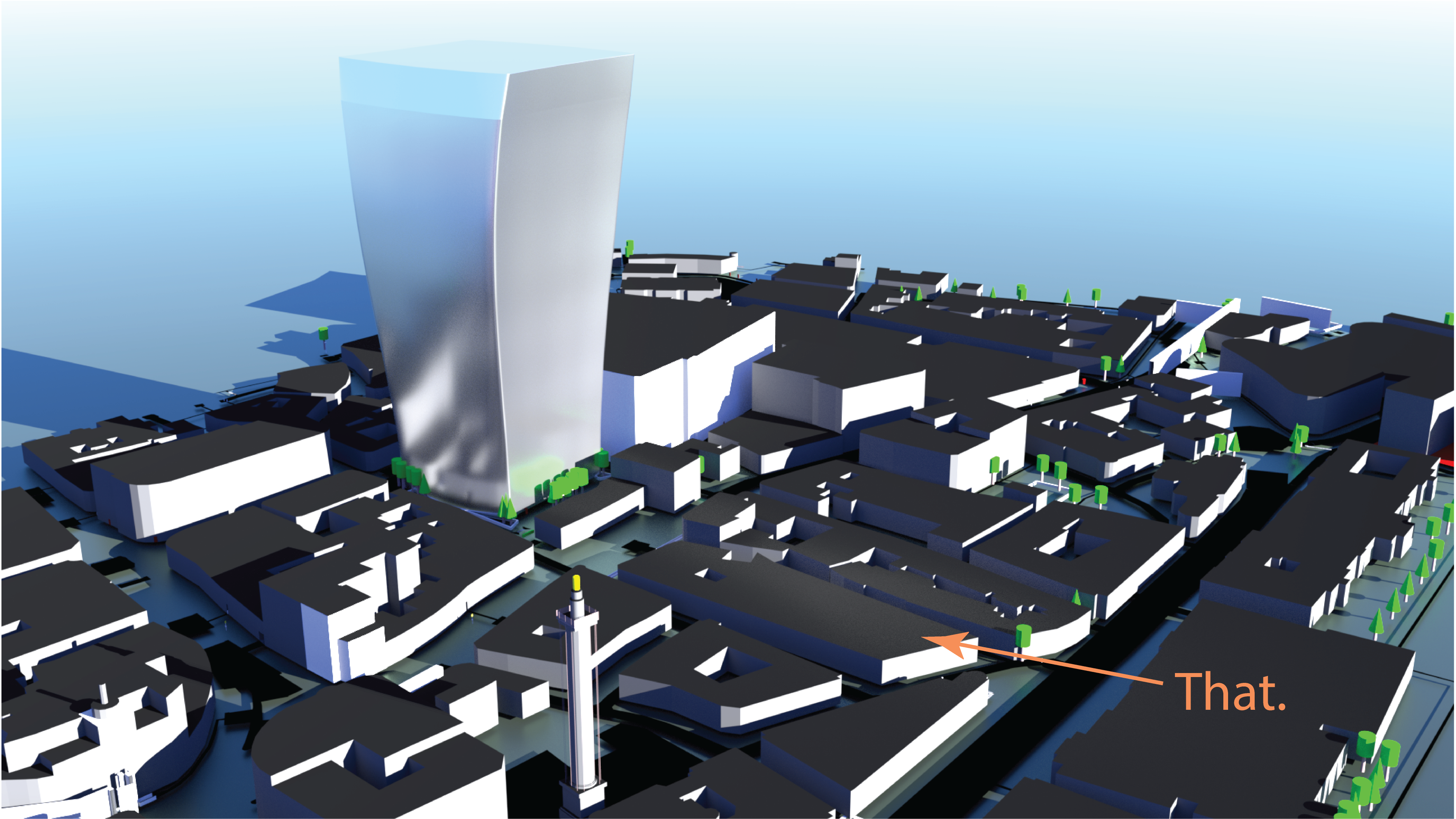
A few years ago, a building in London known as the ‘walkie-talkie’ (actually 20 Fenchurch Street, but ever since the Gherkin it has been mandatory to give big expensive buildings extremely silly names. Can of Ham anyone?) started setting fire to shops and expensive cars. Let’s have a look at why that might be.
The obvious feature of this skyscraper (other than the almost complete incongruity with the surroundings) is that it is strongly curved inwards on its southern side:
Any inward curvature like this will act to focus the incoming light upon reflection. The fact that the tower curves over at the top also helps reflect the incoming light downwards onto the buildings it looms over.
Intriguingly, the designer of the walkie-talkie Rafael Viñoly was also responsible for a similar ‘death ray’ in Las Vegas. Perhaps he assumed the notoriously feeble British sunshine could never be focussed to high enough intensities to ever cause damage?
I’ll chronicle here my attempt to model this situation, inspired by this paper from my alma mater. While the paper is thorough, follows best scientific practices, and uses proper solar irradiance profiles, the visualisations left me wanting more. Casting proper science aside, let’s right that wrong and dig in.
The building
My initial thought was to model everything in Blender, and just let the rendering engine do all of the hard work of calculating light paths.
To draw up the building, I used the floorplans available here to get the shape correct, and smoothly interpolated the building shape between the floors.
Floor 7, featuring some pretty sweet corner offices.
I also used the surprisingly awesome export feature of OpenStreetMaps which includes building shapes and heights, then ran the export through the equally awesome OSM2World which spits out file formats readable by other 3D software – in this case, Blender.
A bit of modelling, importing, and rendering later, we get a lovely view of this chunk of the City, with some minimal external lighting:
Great (I thought). Let’s stick a sun lamp into the scene, and see which building it focusses on:
This was a bit disappointing – a faint splodge of white was not the death ray I was hoping for. Much fiddling with materials, lighting and renderer settings improved the render slightly, but it was still a struggle to generate anything which looked like it might melt a car.
Doing things properly
Leaving Blender behind then, I loaded the building model into python using trimesh, which also very helpfully does efficient ray-surface intersection calculations. Firing a load of rays at the building surface with direction , calculating where they hit, and calculating the reflected ray direction using
(where is the normal direction at the surface), I could now trace the evolution of the reflected death ray intensity:
Here the incoming rays are spaced evenly in the plane normal to their direction, and so the density of rays at any point gives the light intensity. This is a simplified approximation, but will suffice for our purposes.
Tracing the paths of many thousands of rays, we can start to see how the reflected light propagates:
The rectangular region contains the intersections between the reflected rays and the ground.
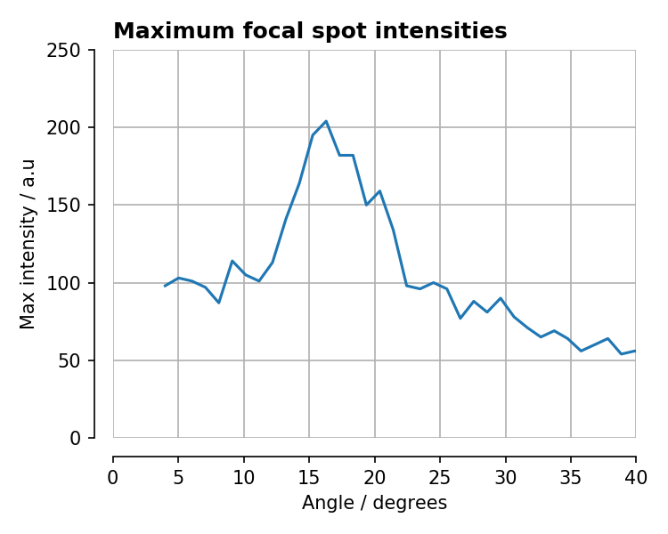
Here is actually the worst-case scenario – at an incident angle of around 16 degrees the light comes to a focus almost exactly on the ground. If we calculate the ray density on the ground, we can plot the ‘focal spot’ produced by the building:
The units on the axes are arbitrary.
Frighteningly, a significant portion of the entire incident light field is focussed to a small point, with the rest spread behind it longitudinally.
Varying the incident ray angle, we see how the light comes in and out of focus (we don’t show the incident rays for clarity):
The non-uniformities in the transverse direction are probably due to non-perfect smoothing of the building mesh – focal spots are very sensitive to departures from surfaces of constant second derivative.
If we plot the maximum intensity of the focal spot as a function of ray angle, there is a clear peak:
From this surprisingly cool site, we know that in summer time in London, the sun is at 16 degrees at 8AM in the morning and 6PM in the evening. Given these are peak commuting times, the unwary commuter could have ended up with a nasty surprise! Indeed, the paper linked above concludes that sun intensities may have been boosted by a factor of up to 16 times.
Fortunately, shortly after London started melting the developers applied some protective covers to the southern face of the building. This is much safer, and the right thing to do, but has the unfortunate side effect of completely ruining my chances of dropping the words ‘death-ray’ into casual conversation. Guess we’ll just have to wait for Rafael’s next great project.
As I was watching an episode of Only Connect the other day, I learned an (almost) interesting fact about London tube stations:
St. John’s Wood is the only tube station not to share any letters with the word mackerel
Someone, for some reason, some time.
This was such a delightfully pointless fact, that my curiosity was instantly piqued. Why this station? That word? Is it unique, or unusual for this to happen? Let’s, dear reader, find out for ourselves.
This post is about me finally getting over a slight irritation that happened nearly a decade ago, one which was almost completely inconsequential. Fortunately, it was related to physics, so is fair game here.


 , calculating where they hit, and calculating the reflected ray direction
  using
using
 is the normal direction at the surface), I could now trace the evolution of the reflected death ray intensity: